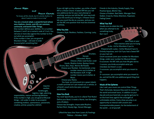
Improved text / image layout for readability
Sweet Riffs and Power Chords » Devlog

I think the title of this post explains what's going on. I got a lot of feedback about how hard it was to read the text imposed over the guitar. Someone kindly suggested I try wrapping the text around the guitar, instead. I made the font 10 points, which may be a challenge to read. Another option is to go to two pages with additional content. Let me know if you'd be interested in seeing that; I'm not totally bound to the one page aesthetic though I do like that I'm following so closely to my inspiration.
Files
SweetRiffsPowerChords.pdf 407 kB
Oct 09, 2020
Get Sweet Riffs and Power Chords
Sweet Riffs and Power Chords
Eldritch metal madness rpg.
| Status | Released |
| Category | Physical game |
| Author | @tibbius@dice.camp |
| Genre | Adventure, Role Playing |
| Tags | Action RPG, cthulhu, guitars, Horror, lasers-feelings, rock |
More posts
- Nice to see this still getting loveAug 24, 2021
- Dead can Dance (A Halloween Module)Oct 10, 2020
- Musicians Practice!Oct 10, 2020
- Updated layout and added CC licenseOct 10, 2020
Leave a comment
Log in with itch.io to leave a comment.